

I wanted to reimagine the isometric, low poly style of a previous game into something more relatable.
The previous game was an advertising agency simulator. Not a lot of people understood – or cared to understand – the inner workings of the advertising industry. And if I’m being honest, white-collar jobs aren’t exactly blissful escapism.
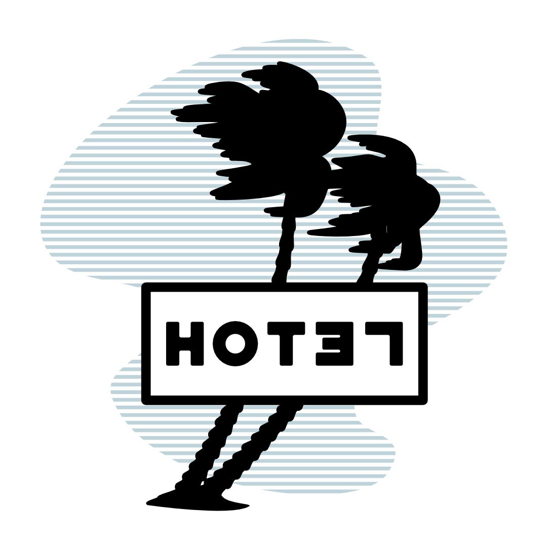
On that note, I decided literal escapism – travel – was the right path, more explicitly, a hotel. Which brings us to the not-flowery part:
I simply did not want to give this game a name beyond the simple five-letter word, “hotel.”
Owning a simple five-letter word, especially a fairly common word, is practically impossible (unless you’re a certain computer company).
I ultimately decided to adopt a l33t solution: HOT37.


...